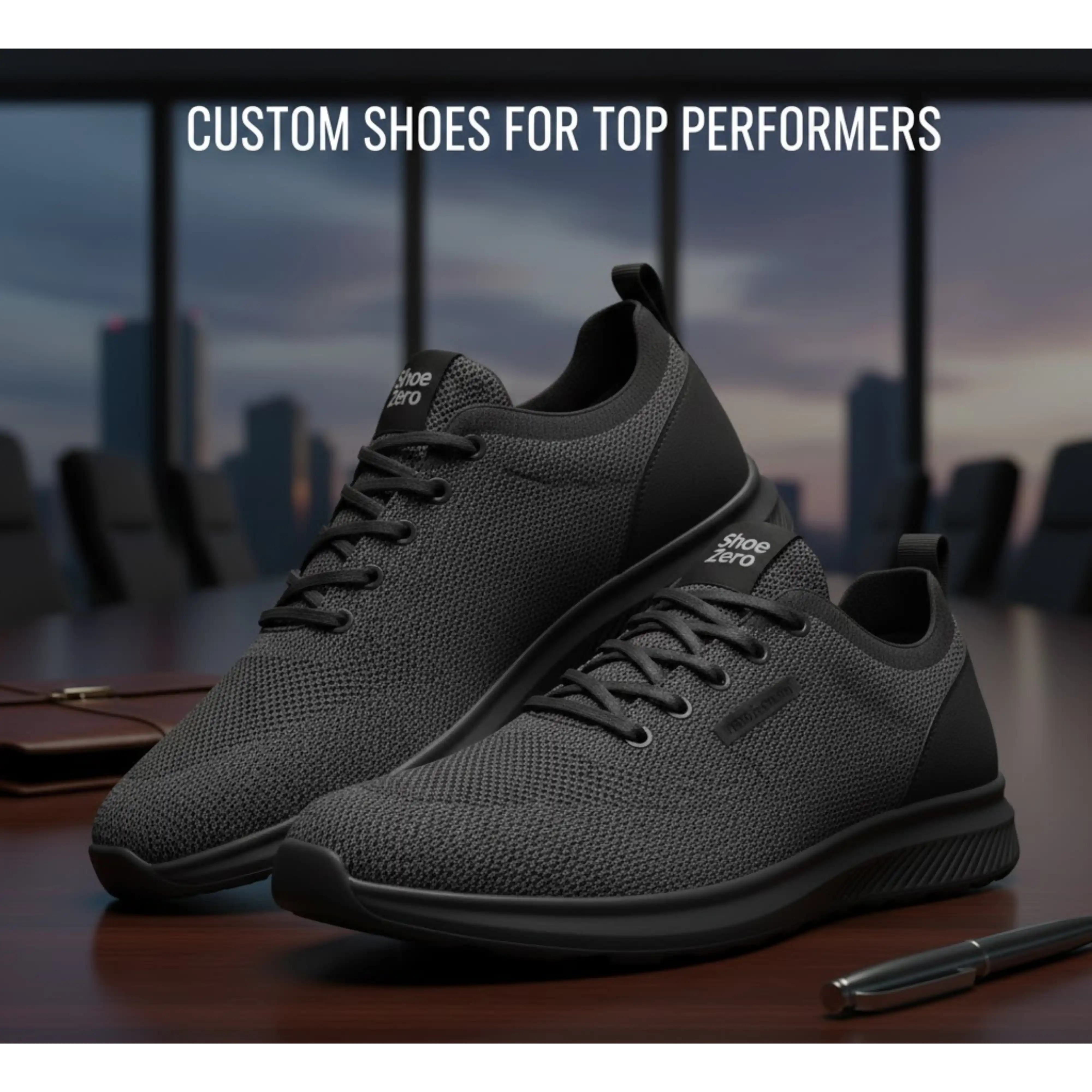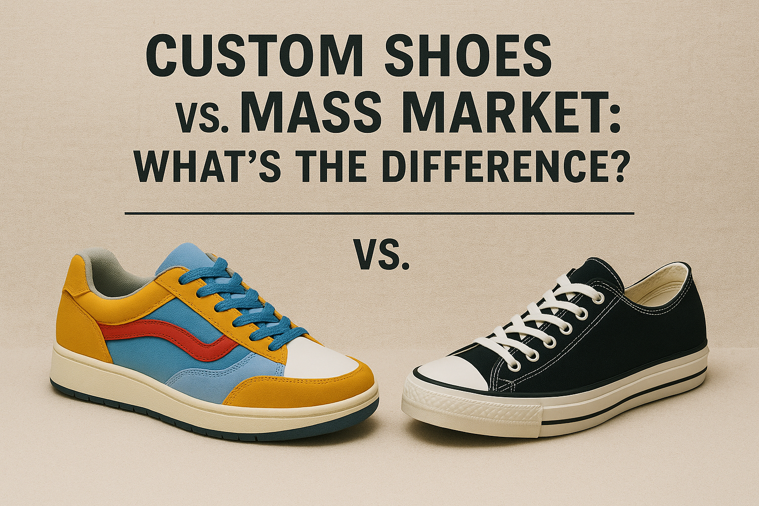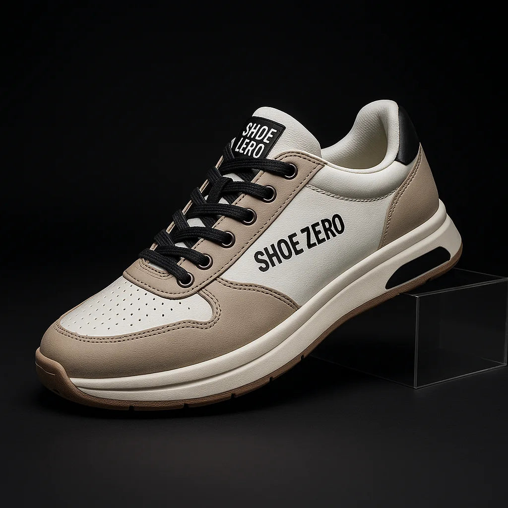
Source: Pexels
So, you've designed a super-comfortable, durable, maybe even highly technically advanced shoe, but you're struggling with sales. Why is that? We can practically guarantee it's because your visual branding doesn’t communicate that appeal.
The footwear industry is saturated with brands competing not just on quality but on aesthetics, identity, and emotional connection. It's a complex package, but one that customers have come to expect. And if customers don’t find your brand visually engaging? It's easy for them to move on to one that is. After all, there are plenty of them out there.
To stand out from the crowd, attract more customers, and ultimately boost sales, it's crucial to get visual branding right.
The Power of Visual Branding in Footwear Marketing
If you think visual branding is just about making things look nice, you're partly right. After all, humans are visual creatures, so the first impressions matter. No doubt about that. But visual branding goes deeper than this: it also shapes the perception of your entire brand and what it stands for.
A well-designed logo, a consistent color palette, and carefully curated imagery are all important visual elements that help influence how customers feel about your products. Done right, visual branding helps you stand out, reinforces your brand values, and even justifies higher pricing.
Logo Design
Your logo is often the first visual cue customers associate with your brand so take your time designing it. It should be simple but memorable, and of course reflective of your brand’s essence. Think of Converse’s star, Vans’ wave, or New Balance’s bold initials: they're all simple but clear and therefore hard to forget.
What you want to do is choose a design that aligns with your brand’s core identity. For example, if you’re selling luxury heels, an elegant, minimalist design makes sense. But if you specialize in performance sneakers, a bold, dynamic logo works better.
At the same time, keep scalability in mind. Your logo should look just as good on a shoe tongue as it does on a billboard.
Imagery
Most customers engage with brands visually before they ever read a product description. That's why photography, graphics, and visual storytelling are all so important: they either draw them in or repel them.
To get this part of visual marketing right, make sure every touchpoint - your website, social media, ads, and packaging - maintain a cohesive look that strengthens brand recognition. It's also essential to use professional product photography and avoid poorly lit, low-resolution images like they plague (all they do is diminish the credibility of your brand).
You can also use user-generated content. For example, real customers wearing your footwear: it's a great way to provide authentic social proof.
To create polished marketing materials across all touchpoints, use whatever tech is at your disposal. A PDF editing tool, for example, can help format lookbooks, catalogs, and ad creatives, ensuring they maintain a high-end, professional appearance. We like Canva for this, but there are plenty of other options available.
Color Palette
Colors have an interesting effect on our psyche. They have the power to evoke emotions and so they can influence purchasing decisions (at least they do for about 85% of consumers). That's why you want to be careful when choosing a color palette: it needs to reflect your style and values your brand stands behind.
For example, many luxury brands stick to muted tones, while streetwear labels embrace vibrant hues.
The best thing you can do is take time to research color psychology. To give you an example, the color red evokes energy, so it's great for athletic brands, while black often signals sophistication, making it perfect for luxury labels. Here, too, it's important to stay consistent across all branding materials, from packaging to website design.
Typography
Your choice of font impacts not only readability but also brand perception. A streetwear brand might opt for bold, graffiti-style typography, while a heritage footwear company could lean on classic serif fonts.
Whatever you choose, we recommend limiting typefaces to two or three to maintain a clean, professional look. You also want to prioritize readability - don’t sacrifice clarity for style.
And once more, because it's that important: make sure everything is consistent across platforms, from your website to your packaging.
Cohesion Across All Touchpoints
For your visual branding to be truly effective, every element must work together seamlessly. From your shoe designs to your website layout, social media content, and even the way your packaging is presented, cohesion matters because it builds trust and strengthens recognition.
How do you maintain consistency? Develop brand guidelines that define it all: logo usage, colors, typography, imagery styles, everything.
You also want to adapt to the times, but not too much. After all, trends change, but the core brand identity should remain recognizable.


